|
|

This is an Expense Journal, made up of a Chart
(graph) that is based on the data in the Sheet above it. Your project is to
create your own version of this Work-sheet and Chart at or about the
same Presentation Quality Level as this one.
This LESSON-TEST is a Teaching
Tool
involving hands-on practice.
Assume nothing. Test everything that
you do, every keystroke, etc in Excel. It is the goal of this
lesson that you are able to create work-sheets at this level and
quality. Click
https://auciello.tripod.com/excelquiz01.xls at any time to
view and download this worksheet.
Choose all statements that are "True".
|
|
1.
|
 This
Lesson-Quiz requires: (1) your opening a blank sheet
in Excel. (1a) Open Excel by clicking its icon on the
desktop, or (1b) finding it under 'Microsoft Office" or (1c)
searching for "EXCEL.EXE" using the 'Search'
feature on the Main Menu. (2) Then you will see a blank
Sheet, like above, without any data. Turn the 'Num Lock' key off,
and using the the arrow keys on the key pad, move the Cell Pointer
(Highlighted Rectangle) to to A1. Type "CIS
701 ..." etc in this row. (3) Type
"Expenses" in A2, then press the right arrow key on the
keypad down to B2, then type "JAN" (do the entire row). Repeat these directions
until what you have typed looks like the first two rows above . This
Lesson-Quiz requires: (1) your opening a blank sheet
in Excel. (1a) Open Excel by clicking its icon on the
desktop, or (1b) finding it under 'Microsoft Office" or (1c)
searching for "EXCEL.EXE" using the 'Search'
feature on the Main Menu. (2) Then you will see a blank
Sheet, like above, without any data. Turn the 'Num Lock' key off,
and using the the arrow keys on the key pad, move the Cell Pointer
(Highlighted Rectangle) to to A1. Type "CIS
701 ..." etc in this row. (3) Type
"Expenses" in A2, then press the right arrow key on the
keypad down to B2, then type "JAN" (do the entire row). Repeat these directions
until what you have typed looks like the first two rows above .
Which of the following statements are true?
|
|
2.
|
 (4)
Move to A4. Type "BENEFITS", Press the DOWN ARROW KEY to
move to A5, and type "OVERHEAD" etc. Continue to A9 and "TRAVEL".
(5) Move to B4, Type 1, Move to C4 to Type 2, continue to G4 and
6. (6) Move to B5 and Enter the Rest of the Numbers on the Sheet.
Work by Rows or Columns, whichever you prefer. (7)
Move to H4, Carefully Write a Formula to sum
"BENEFITS" by typing
=SUM(B4:G4) --
To say this
another way -- In cell H4, Type "=" followed by
"SUM" (=SUM so far), then type
"(", the address of the 1st number in the range (B4), then a colon ":",
then the last number in the range (G4), followed by a ")" --
should look like =SUM(B4:G4).
Restating it yet another way: The Math Function "SUM"
begins with an "=" sign, followed by the range to sum --
in this case -- B4:G4 in parenthesis. The colon ":"
signifies that there is a range of cells. The formula sums the
"BENEFITS" row. Be sure that you typed
=SUM(B4:G4) in H4, then press <ENTER> and
you should see 21. Repeat these instructions until the formula
gives 21 in H4. (4)
Move to A4. Type "BENEFITS", Press the DOWN ARROW KEY to
move to A5, and type "OVERHEAD" etc. Continue to A9 and "TRAVEL".
(5) Move to B4, Type 1, Move to C4 to Type 2, continue to G4 and
6. (6) Move to B5 and Enter the Rest of the Numbers on the Sheet.
Work by Rows or Columns, whichever you prefer. (7)
Move to H4, Carefully Write a Formula to sum
"BENEFITS" by typing
=SUM(B4:G4) --
To say this
another way -- In cell H4, Type "=" followed by
"SUM" (=SUM so far), then type
"(", the address of the 1st number in the range (B4), then a colon ":",
then the last number in the range (G4), followed by a ")" --
should look like =SUM(B4:G4).
Restating it yet another way: The Math Function "SUM"
begins with an "=" sign, followed by the range to sum --
in this case -- B4:G4 in parenthesis. The colon ":"
signifies that there is a range of cells. The formula sums the
"BENEFITS" row. Be sure that you typed
=SUM(B4:G4) in H4, then press <ENTER> and
you should see 21. Repeat these instructions until the formula
gives 21 in H4.
Which statements are true?
|
|
|
3.
|
 This
item is about "empowering" you with "Help" command.
Showing Excel Help Page - Contents tab. This
item is about "empowering" you with "Help" command.
Showing Excel Help Page - Contents tab.
Access this page by pressing "F1" (the Help key) located on the top row.
Click "Contents" tab -- Creating Formulas and Auditing Workbooks --
Using Functions -- About Math and Trigonometry functions.
Which of the following statements
are True?
|
|
|
4.
|
SORTING:
means re-ordering the data
table according to Key Fields. Each
row in the table as shown is re-arranged in Ascending order of the
Total Field, which is the Key field. When sorting, all the cells in a
particular row stay together and the row is re-arranged according to the
Key Field. In this case, the data is sorted by TOTAL in ascending
order -- the smallest TOTAL appears first, and the largest last. Which of the following are true?
|
|
|
5.
|
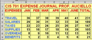
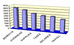
The Sheet above was sorted by TOTAL, and we are
about to create the above Chart by plotting EXPENSES
(horizontally) vs. TOTAL (vertically) to make the above 3D-Column
graph.
|
|
|
6.
|
Time for
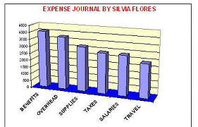 you
to "hack" away and discover! Follow the prompts and your
intuition and continue until your chart looks like this one. you
to "hack" away and discover! Follow the prompts and your
intuition and continue until your chart looks like this one.
|
|
|
7.
|

Your page should look like this: A Sheet in the background, a
Chart covering it, and a Chart toolbar overlaying the Chart. Close
the toolbar by clicking the "X" in the top right corner.
|
|
8
|
Which of the following are correct?
|
|
9.
|
Which of the following STATEMENTS are correct?
|
|
10.
|
This project has several features. Which of the following
statements are correct?
|